

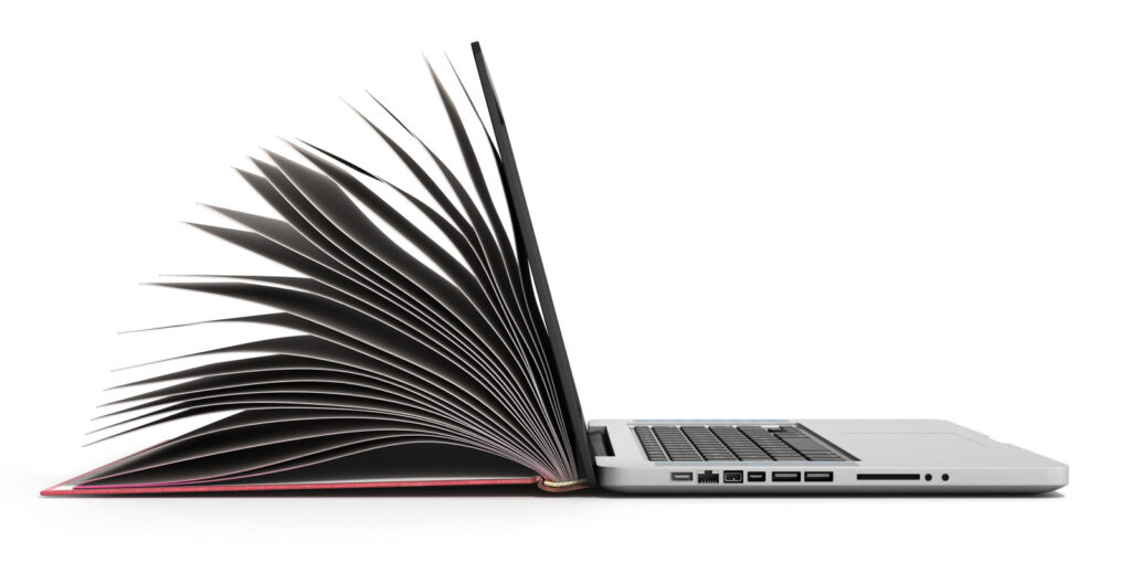
A brochure tells people about your business. A website should help them do something.
There’s a mistake we see again and again when businesses start a new website project. They open with the question “what information do we need to put on it?” So the company history goes in, then the services list, then the team page, the mission statement, a few testimonials, a gallery, some news. Somewhere along the way someone asks if the homepage can “look more exciting”, but nobody’s asked the question that actually matters: what do we want people to do when they get here?
Because a website isn’t a brochure. A brochure introduces your business, presents some information, and leaves a good impression where you pick it up, flip through it, put it down, maybe come back later. A website works differently. Someone arrives already carrying a question, a problem, or an intention. They want to find a product, compare services, get a price, book an appointment, contact someone, download something, find a store, check opening times, read a review, understand what you actually do, or decide whether they trust you. Your job is to help them get there.
The homepage isn’t an introduction to your company
This is usually where things go wrong. Businesses naturally want to start with themselves: we’ve been operating since 1987, we’re a leading provider of…, our company was founded by…, we offer a comprehensive range of. None of that is bad information exactly, it’s just rarely the right thing to lead with. Your customer didn’t come to your site wondering about your company history; they came because they want something. A good website starts from “what does this person need to know, and what do we want them to do next?” rather than “what do we want to tell people?” It’s a different question, and it leads to a very different site.
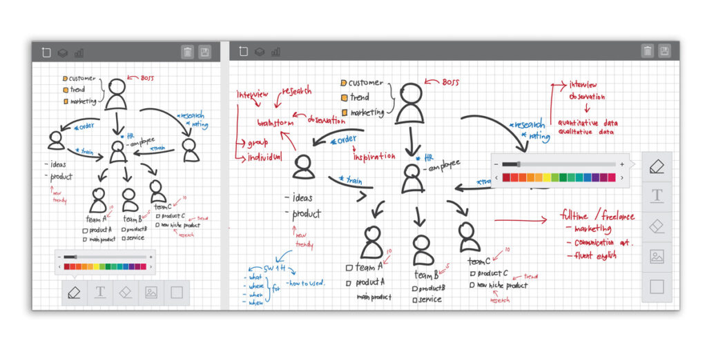
Every page should have a job
That doesn’t mean slapping a BUY NOW button on everything. Sometimes the job is small. A product page needs someone to add an item to their basket. A service page needs to convince someone to enquire. An About page needs to build enough trust that someone picks up the phone. A store directory needs to help someone find a shop. A careers page needs an application. A blog post needs to answer a question well enough that the reader wants to see what else is on the site. The action changes from page to page, but there should always be a reason the page exists. If you can’t say what a page is supposed to achieve, it probably shouldn’t be there.
More information doesn’t make a better website
One of the hardest parts of building a website is deciding what to leave out. Clients know their own business inside out, so there’s always a pull to include everything, every service, every award, every paragraph from the old site, every photo, every question anyone’s ever asked, every department, every year of history. The result is often a site that’s technically comprehensive and practically exhausting to use.
Good design isn’t about fitting everything in; it’s about helping people find what matters. That means thinking about hierarchy: what should someone see first, what should they understand within five seconds, what can wait, what needs a button versus an explanation, and what can just disappear. These read like design decisions, but they’re really strategic ones.

Design should follow the journey
This is why we don’t start a website project by opening a design programme. Before colours, typography or photography come into it, we need to understand who’s visiting, why, what they’re trying to achieve, what might stop them, what they need to know to decide, and what should happen next. Only once we understand that does the visual design start to make sense, because the best-looking website in the world is still a poor one if people can’t work out what to do on it.
A good website feels obvious
Good digital design has a particular quality: it feels easy. You don’t have to think about where to click, decode the navigation, hunt for contact details, or read three paragraphs to work out what the company actually does. You just move through it. That’s not an accident. A good website answers the questions people have before they’ve consciously asked them: what is this, is it for me, can I trust it, how does it work, what will it cost, what do I do next. The better the site, the less work the visitor has to do.
So what should your website actually do?
Before you think about colour palettes, ask these questions instead:
- Who is the website really for? Not “everyone” – be specific.
- Why are they coming? What are they trying to find, solve, buy, understand or achieve?
- What are the most important things they need to know? Not everything you know, the things that matter to them.
- What do you want them to do? Call, enquire, buy, book, visit, download, sign up?
- What could stop them? Confusing navigation, too much information, a poor mobile experience, lack of trust, no clear next step?
- How will you know if it’s working? Traffic is useful, but it isn’t the goal. A site that pulls in 10,000 visitors and converts none of them isn’t necessarily doing better than one that pulls in 1,000 relevant visitors and turns 100 into customers.

The best website isn’t the one that says the most
It’s the one that helps the right person make the right decision. That’s why we don’t think of websites as digital brochures. A brochure says “here we are, this is what we do.” A good website says “you’re here for a reason, let’s help you get where you need to go.” It’s a much better place to start.
Need a website that actually works?
At Blue Juice, we start by understanding the problem before we design the solution. If your current site has turned into a collection of information rather than something your customers can actually use, it might be time to rethink what it’s there to do.
Let’s talk about your next website.